Mobile support
Does Ydesign support mobile and touch devices?
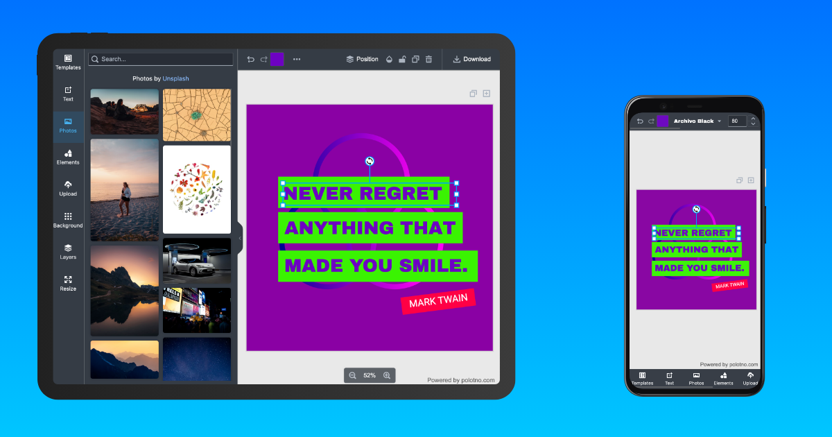
✅ Yes. On mobile browsers, Ydesign's editor automatically flips into a compact layout: the top toolbar collapses, side panels become a bottom drawer, and gestures take priority. Users can design on phones and tablets directly.
📱 Scope: Ydesign targets browser environments. For native mobile apps, wrap it in a WebView rather than bundling as a native app.
Automatic detection: a 768px breakpoint
Ydesign uses 768px as the mobile / desktop boundary by default:
// packages/react-editor/src/utils/screen.ts
export const MOBILE_BREAKPOINT = 768;

export const isMobile = () => window.innerWidth <= MOBILE_BREAKPOINT;
export const isTouchDevice = () =>
  'ontouchstart' in window || navigator.maxTouchPoints > 0;
All built-in components (<SidePanel />, <Toolbar />, <ZoomButtons />, etc.) listen for window resizes and automatically switch between desktop and mobile modes. Most of the time you don't have to do anything.
Force mobile mode on a large screen
Sometimes you want the compact layout even on desktop — for example, when embedding the editor in a narrow sidebar. Add polotno-mobile to any ancestor element and every built-in component flips to mobile mode:
<body class="polotno-mobile">
  <div id="root"></div>
</body>
Or toggle it conditionally:
<div className={compact ? 'polotno-mobile' : ''}>
  <DesignEditorApp store={store} />
</div>
The class will be renamed to ydesign-mobile over time, with aliases maintained for backward compatibility.
Sync mobile / desktop state in your own components
When you write custom Sections or toolbars and want them to follow the built-in mobile switch, Ydesign exposes two helpers:
useMobile() hook (recommended)
Reactively reports the current mobile state; the component re-renders on resize:
import { useMobile } from '@ydesign/react-editor/utils/screen';

function MySection() {
  const mobile = useMobile();
  return (
    <div style={{ padding: mobile ? 8 : 24, fontSize: mobile ? 13 : 15 }}>
      {mobile ? 'Compact layout' : 'Desktop layout'}
    </div>
  );
}
mobileStyle(...) (styled-components template helper)
Produces a "media query + .polotno-mobile" double-trigger style block:
import styled from 'styled-components';
import { mobileStyle } from '@ydesign/react-editor/utils/screen';

const Panel = styled.div`
  padding: 24px;
  font-size: 15px;

  ${mobileStyle(`
    padding: 8px;
    font-size: 13px;
  `)}
`;
This way, when a parent is tagged polotno-mobile your component also switches to the compact look — consistency guaranteed.
Touch gestures
On mobile, Ydesign enables canvas-specific touch gestures:
| Gesture | Behavior |
|---|---|
| One-finger drag | Move the selected element |
| Two-finger pinch | Zoom the canvas |
| Two-finger pan | Pan the viewport |
| Double-tap on image | Enter crop mode (same as desktop) |
| Long-press on element | Trigger the (planned) context menu |
To add your own gestures, attach onTouchStart / onTouchMove listeners to <Workspace />'s parent container — Ydesign doesn't stop bubbling.
FAQ
Q: I want the desktop browser to always show the compact layout.
A: Either limit the editor container width to 768px, or add polotno-mobile on a parent.
Q: Some toolbar buttons collapse on mobile — can I force them all visible? A: The built-in Toolbar auto-collapses. For full control, rewrite with Toolbar's composition pattern.
Q: Two-finger zoom in mobile browsers triggers page zoom, not canvas zoom. A: Add a stricter viewport meta:
<meta name="viewport" content="width=device-width, initial-scale=1, maximum-scale=1, user-scalable=no" />
Pinch gestures now only affect the canvas.
See also
- 👉 Theming & UI styles — dark / light and brand color overrides
- 👉 Workspace — canvas-level configuration
- 👉 Utility Functions · screen —
useMobile/mobileStylefull API