Tooltip (Floating Toolbar)
A floating tooltip (a compact action bar that follows the selected element) is not yet shipped in @ydesign/react-editor.
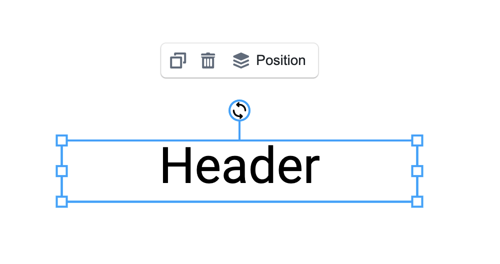
Today, all element actions live in the top <Toolbar />. If you want a Figma/Canva-style "pop a little toolbar next to the text I just selected" interaction, this page documents the workarounds you can use now and what we plan to ship.
Why a Tooltip?
The top Toolbar is a horizontal strip — stable and discoverable, but:
- It's far from the element you're editing, forcing eye flicks up and down
- On narrow / multi-column layouts, horizontal space is tight
- For frequent "tweak color, bump font size, nudge size a bit" actions, it's simply too heavy
A floating tooltip puts high-frequency actions right next to the element, and gets out of the way when you're done.
Workarounds available today
Until the native Tooltip ships, you can approximate the experience with either of these:
Approach 1: a custom overlay that listens to selection:changed
Idea: render an absolutely positioned React component, subscribe to Editor selection + canvas transform, compute the element's on-screen rect, and render your toolbar at that position.
import { useEffect, useState } from 'react';
import { observer } from 'mobx-react-lite';

const FloatingTooltip = observer(({ store }) => {
  const [rect, setRect] = useState<DOMRect | null>(null);
  const el = store.selectedElements[0];

  useEffect(() => {
    if (!el || !store.editor) {
      setRect(null);
      return;
    }

    const canvas = store.editor.customCanvas.canvas;
    const update = () => {
      const bounding = el.getBoundingRect(); // Fabric API
      const vpt = canvas.viewportTransform!;
      const zoom = vpt[0];
      setRect(
        new DOMRect(
          bounding.left * zoom + vpt[4],
          bounding.top * zoom + vpt[5],
          bounding.width * zoom,
          bounding.height * zoom,
        ),
      );
    };

    update();
    // Sync position after every canvas render
    canvas.on('after:render', update);
    return () => {
      canvas.off('after:render', update);
    };
  }, [el, store.editor]);

  if (!el || !rect) return null;

  return (
    <div
      style={{
        position: 'absolute',
        left: rect.left,
        top: rect.top - 48, // 48px above the element
        zIndex: 100,
        background: '#fff',
        boxShadow: '0 4px 12px rgba(0,0,0,0.15)',
        borderRadius: 8,
        padding: '4px 8px',
        display: 'flex',
        gap: 4,
      }}
    >
      {/* your high-frequency actions: color, font size, alignment… */}
      <button onClick={() => store.set({ fontWeight: 'bold' }, el)}>B</button>
      <button onClick={() => store.set({ fontStyle: 'italic' }, el)}>I</button>
      <input
        type="color"
        value={el.fill as string}
        onChange={e => store.set({ fill: e.target.value }, el)}
      />
    </div>
  );
});

// Render alongside <Workspace /> in a positioned container
<div style={{ position: 'relative', flex: 1 }}>
  <Workspace store={store} />
  <FloatingTooltip store={store} />
</div>;
💡 The key line is
canvas.on('after:render', update)— Fabric fires this every time the canvas repaints, which keeps the overlay aligned during zoom / pan / canvas resize.
Approach 2: borrow Antd's Popover as the floating container
If you only want a popover that shows after clicking (not following continuously), Antd's Popover is the fastest path:
import { Popover } from 'antd';
import { observer } from 'mobx-react-lite';

const ElementPopover = observer(({ store, anchorRef, children }) => {
  const visible = store.selectedElementsIds.length > 0;

  return (
    <Popover
      open={visible}
      placement="top"
      trigger="click"
      content={children}
      getPopupContainer={() => anchorRef.current}
    >
      {/* anchor at the element's on-screen position */}
      <div ref={anchorRef} style={{ position: 'absolute', /* coords as above */ }} />
    </Popover>
  );
});
Cheapest to implement, but animations/positioning come from the browser defaults.
Planned native Tooltip
We plan to ship an official <Tooltip /> component that plugs into <Workspace /> and provides:
- Automatic positioning via Fabric
getBoundingRect+ viewport transform, staying aligned with zoom/pan - Edge avoidance — flips to the bottom / side when the element is near the canvas edge
- Type-aware rendering — same pattern as Toolbar: switch content by selected element type (
TextTooltip/ImageTooltip/ …) - Customizable — replace per-type tooltip via a
componentsprop, or disable altogether - Multi-selection merging — shows a
ManyTooltipwhen several elements are selected
Expected API (draft)
import { Tooltip } from '@ydesign/react-editor/canvas/tooltip';
import Workspace from '@ydesign/react-editor/canvas/workspace';

<div style={{ position: 'relative', flex: 1 }}>
  <Workspace store={store} />
  <Tooltip store={store} />
</div>;
With per-type customization and one-off disable:
const MyImageTooltip = ({ store, element }) => (
  <div>
    <button onClick={() => store.editor?.imageCropHandler.cropImg.onEnterCrop(element)}>
      Crop
    </button>
  </div>
);

// Customize only the image tooltip; disable the text one
<Tooltip
  store={store}
  components={{
    image: MyImageTooltip,
    textbox: () => null,
  }}
/>;
Roadmap
- M1 — Base floating container + auto-follow (single selection)
- M2 — Built-in
TextTooltip/ImageTooltip/FigureTooltip - M3 — Multi-selection (
ManyTooltip) - M4 — Canvas-edge avoidance
- M5 — "Sync hide with Toolbar" option (avoid feature duplication)
To help design or beta-test, please join us in GitHub Discussions.
Differences from Polotno's Tooltip
Polotno's <Tooltip /> is built on Konva + Blueprint; Ydesign is on Fabric + Antd. That means:
- Coordinate math differs — Polotno uses Konva node APIs; Ydesign uses Fabric's
getBoundingRect+viewportTransform - Override granularity differs — Polotno goes as deep as
TextFill; Ydesign plans element-type-level overrides (matching Toolbar) - Direct code migration isn't possible — APIs don't line up
If you're porting a Polotno tooltip setup over, use Approach 1 above first and refactor once the native <Tooltip /> ships.
Next
- 👉 Toolbar
- 👉 Workspace
- 👉 Customizations